
bad parental control UI on mobile
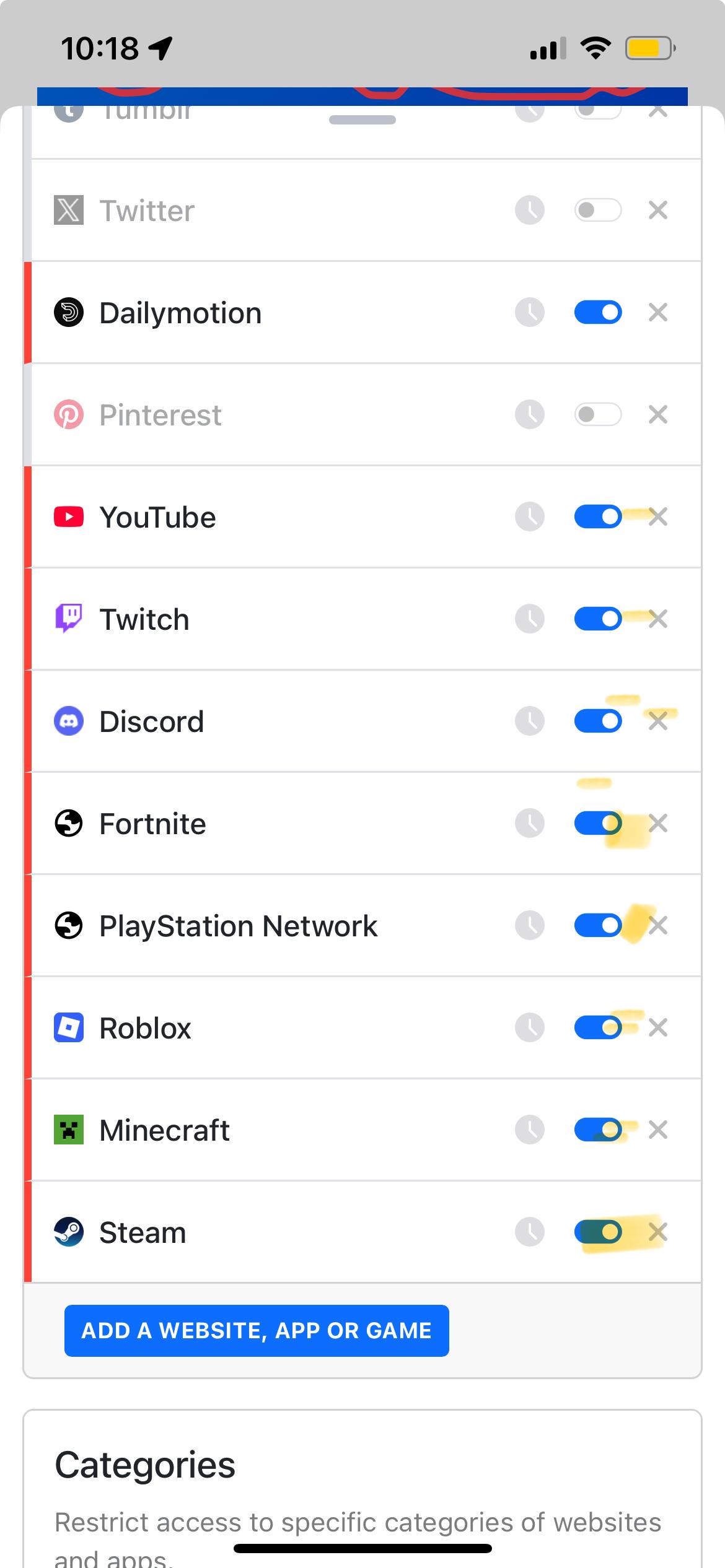
First of all, the parental control feature itself works great and is better than any other solution out there. The mobile UI, however, makes me lose more hair than necessary each time I use it: the 'delete' and 'turn on/off' buttons are next to each other, eclipsed by my thumb when holding device and sized for size of a toddler's pinky, not a grown up right-handed male's thumb.. Each time I try to turn on/off a service, there's a risk to accidentally delete the service altogether (w/o any confirmation dialogue btw!). I think, it's worth giving one of your devs a mobile device, so they can actually test it before deploying.
In the screenshot attached I tried to put a yellow mark on the 'on/off' switch, and as you can see, unless I really focus, the mark often lands on delete 'x' button.
Reply
Content aside
-
1
Votes
- 3 mths agoLast active
- 74Views
-
1
Following